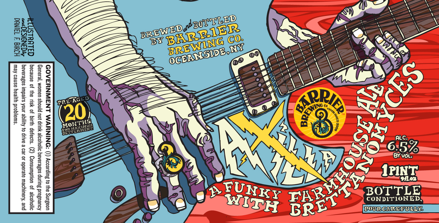
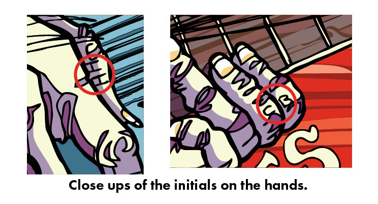
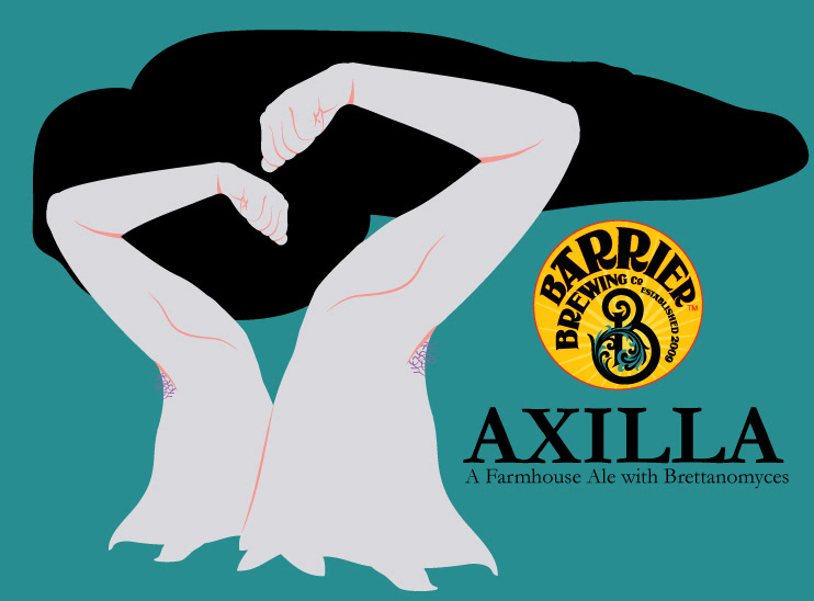
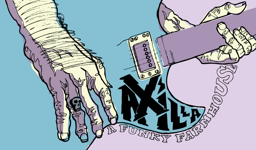
These are the first (of probably many more) labels for a local brewery here in NY. These beers are all fantastic so it was a pleasure putting my graphics to help promote their brand. "Axilla" was the first one and the original idea they wanted was to have a hippie chick with her arms up and stink lines spelling out Axilla (which means armpit.) I thought we could come up with something better and I went through so many sketches to get something else and after one night of drinking with some friends in the beer industry, my one friend, Christian Blake said well it's based off the Phish song and it starts with a huge bend so do some close-ups of some gnarly hands and that's your label. Perfect. I used Keith Richards hands as the base for my drawing and tried to make the bottom of the guitar sorta look like an armpit with the stink lines oozing out and spelling out "A funky farmhouse ale..." It doesn't matter much if no one picks up on that but that was the intention. I ended up thanking two people ON the label (see detail shots below) by adding Christian Blake's initials for the initial idea and "HH" for Hannah House for her help cleaning up the file. It really helps having a second pair of eyes to check things over.
Here are some original ideas and sketches for the initial bottle including the arm pit forest (that I never showed anyone.) The bottom sketch is pretty much the original one I sent to Barrier to get them on board except I think I had the red background on it then because it was originally from another project that hadn't gotten used.
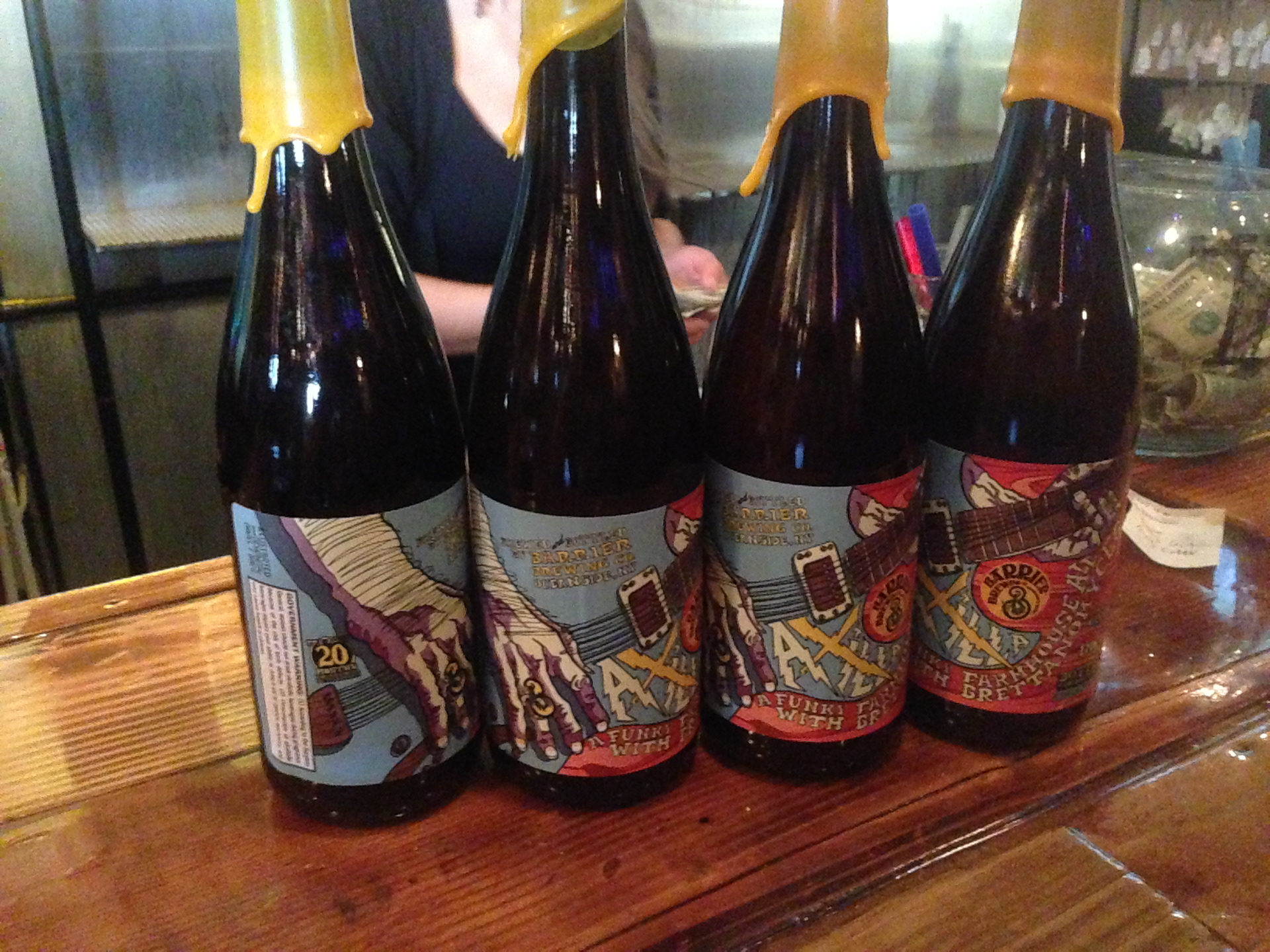
The gold wax finished the look of the design perfectly (which was the brewery's idea and an excellent one at that!) The brewery loved this one so we did another one.
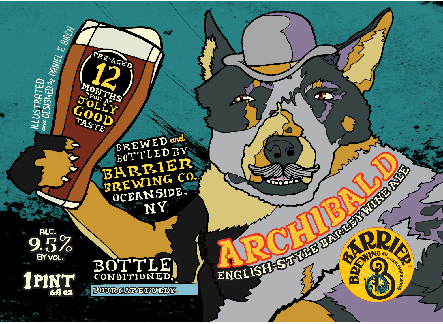
Enter "Archibald" which was based on Evan Klein's (the brewer) dog. It's an English style barley wine beer. This one was easy. I redid an idea I had done a year before for a poster for another local brewery (Singlecut) who were working with the dog adoption group "Friends with Four Paws." I took a picture of Archy and drew him and added the beer in the paw second. I felt to make the dog more classic British I put a bowler and a stash on him. I also used many of the same colors from the "Axilla" label to try and keep all of them branded together thus promoting the brewery and the beers better. They again chose a great wax color that made the bottle really pop.

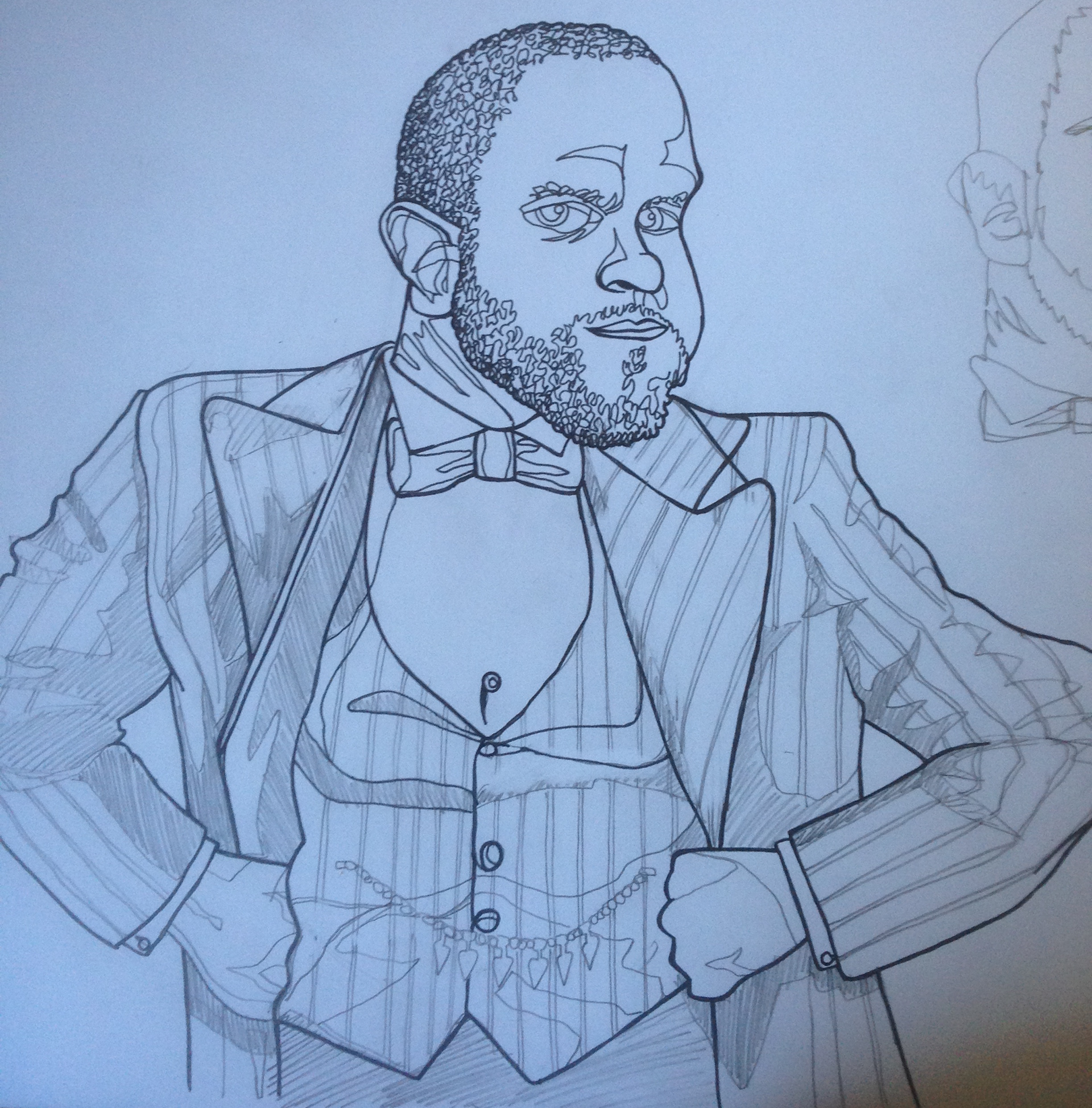
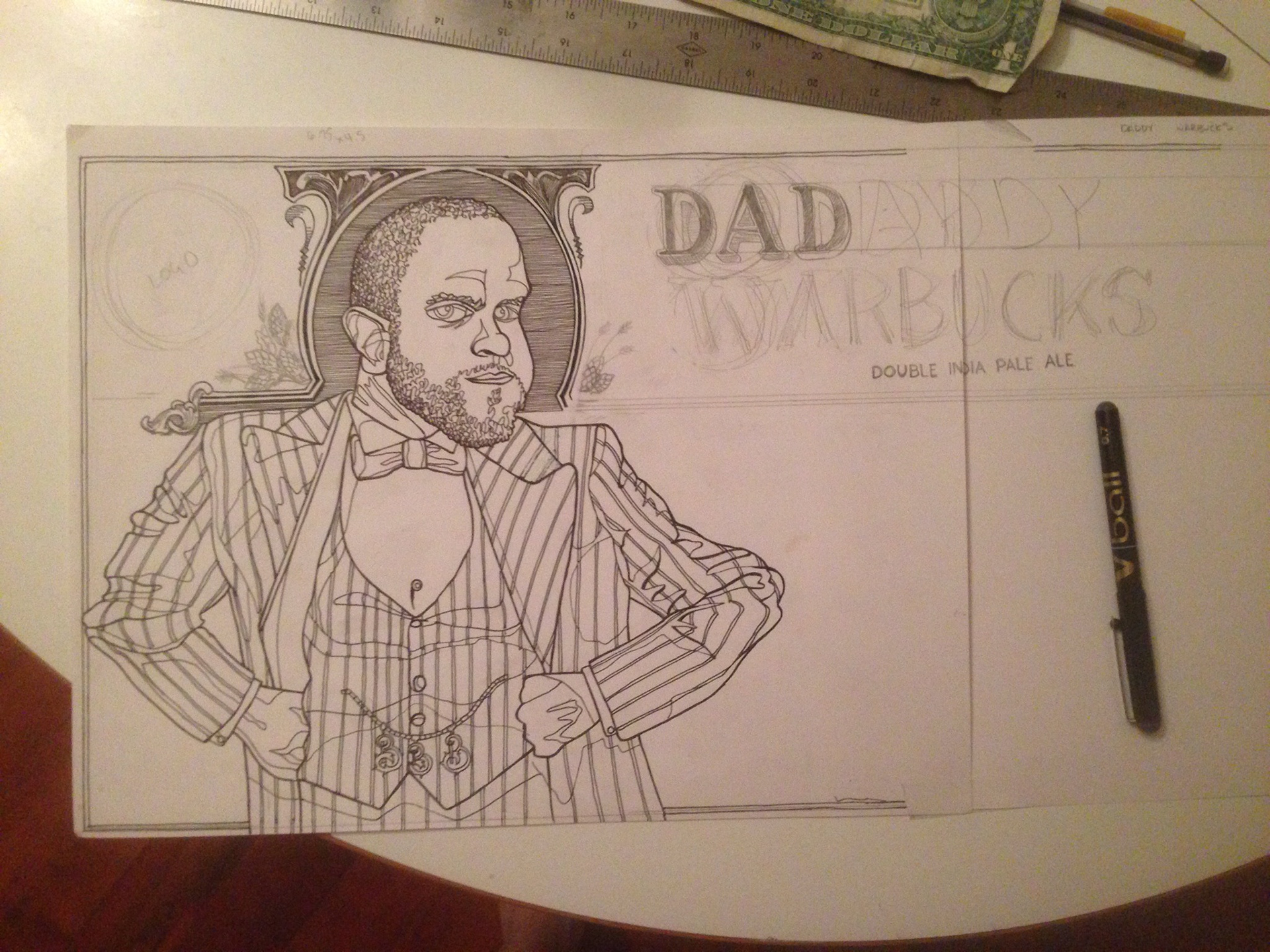
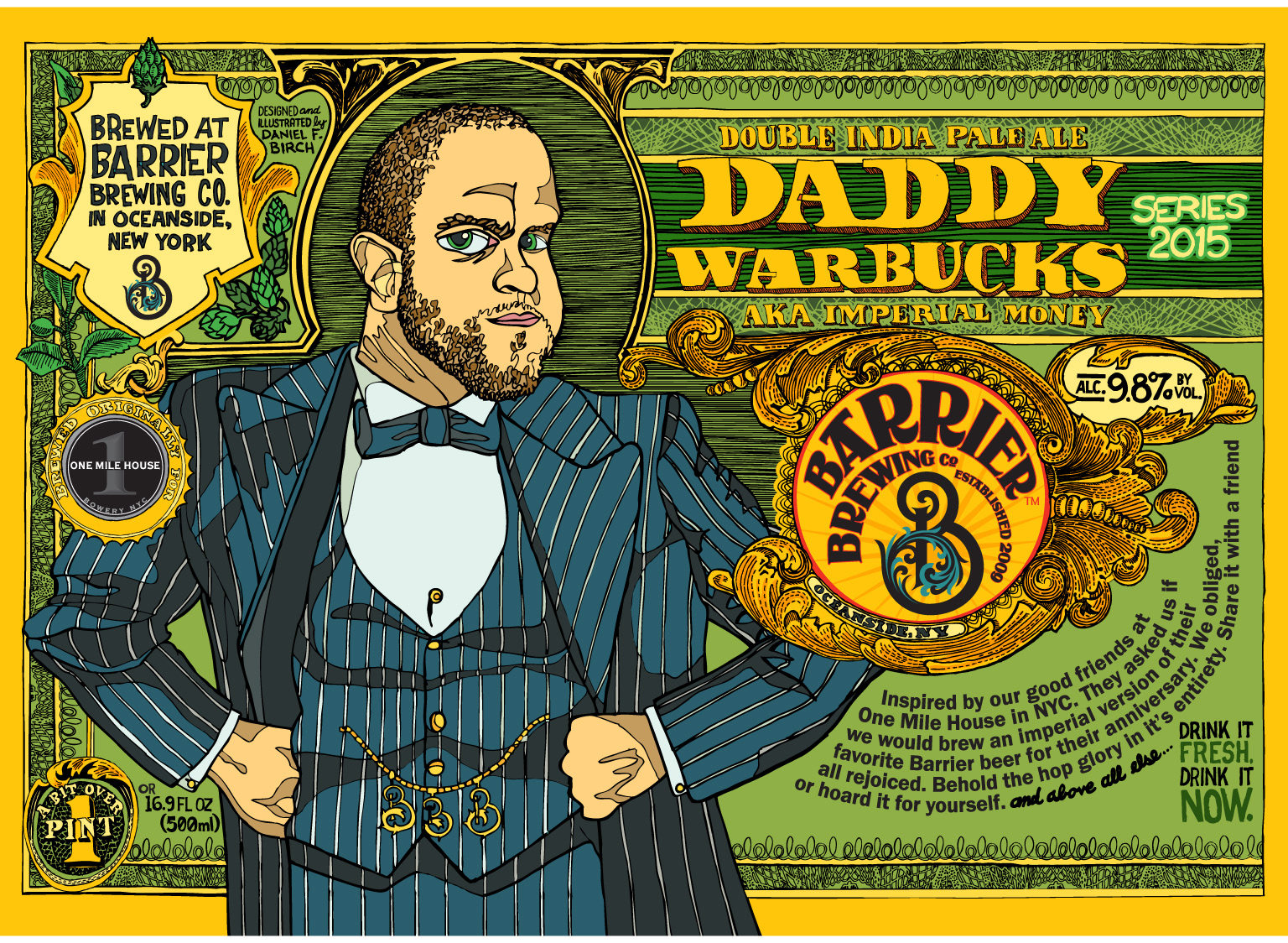
The last one, which hasn't been released yet is a rebrand of a beer called "Daddy Warbucks aka Imperial Money." It's part of their Money IPA series, this being the double IPA, "Money" being their regular IPA and "Non-Cents" their half IPA. I had talked to another local artist Squigs who does great illustrations and had done 2 labels for Barrier as well. He wanted to do a set of bottles that when put together made a bigger image, which is always cool when done right. That got me thinking of what I could do to have a theme that would brand all my bottles together instead of them just standing alone. It started out of the 2nd bottle, it was based off Evan's dog so I based Daddy Warbucks off Mike Descarfino who is their sales rep (and probably the main reason I got hooked up doing graphics for them.) I thought, lets start showcasing the dogs and the people that work like them to promote this great brewery. I thought on top of that, it spoke of the brewery using this character who was a self-made man. Mike loved it so I took a train out to the brewery and talked to Evan who loved it as well. I based the drawing off of Albert Finney from the 1982 production of Annie that we all had to suffer through as kids. I then took every kind of legally traded American bill (even a $2 bill thanks to friend and roomate Juren David) and made a photo-realistic version. It was never intended to be used as anything but reference. A bit over kill on hind sight but it sure didn't hurt the drawing any.
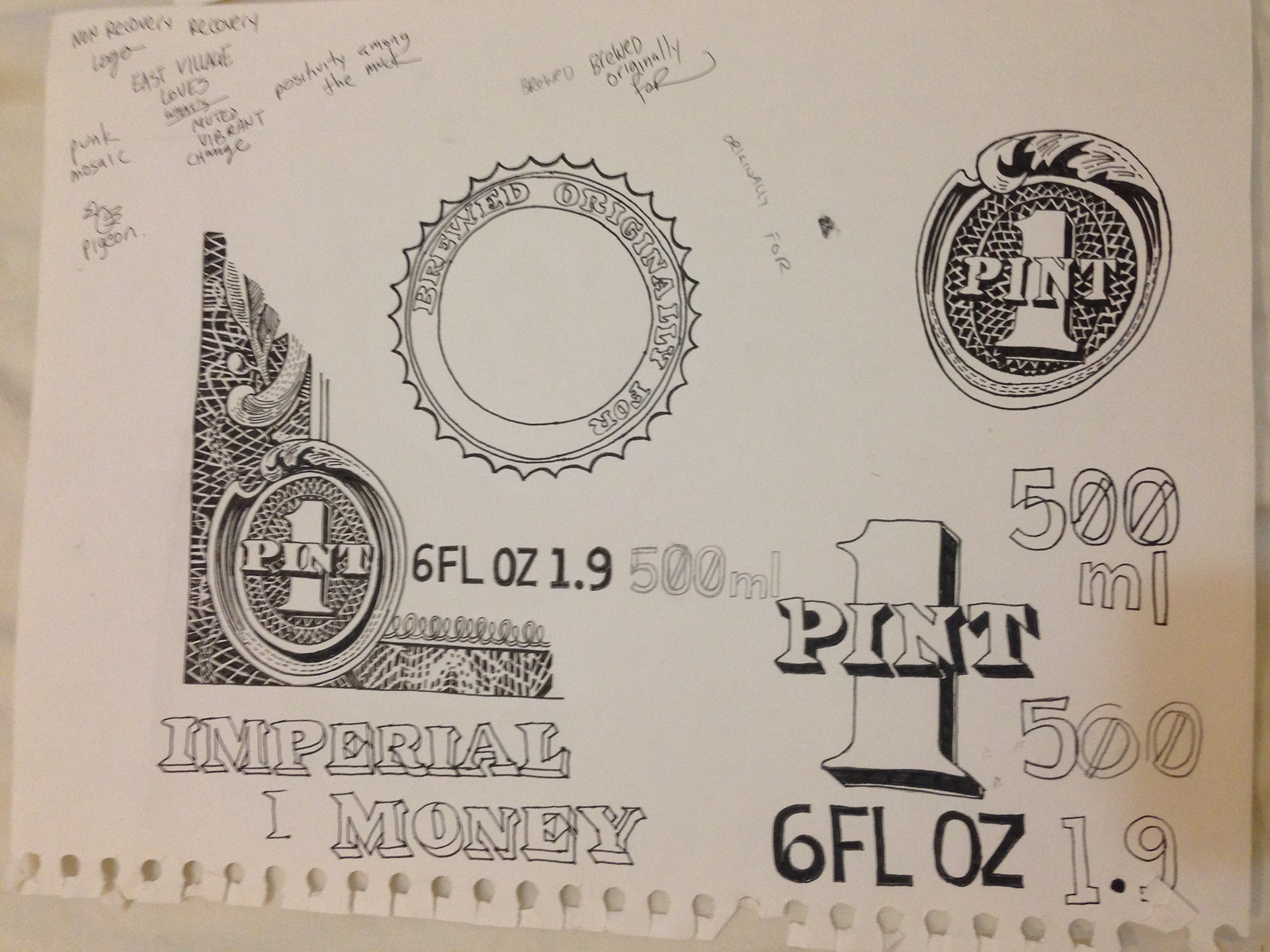
I've included a sample of sketches I did. Some parts made it and others didn't. The one sketch of the dollar bill with pint was the original direction but it was way too realistic looking so it was scrapped. Below are some of the original sketches for Mike as Warbucks.