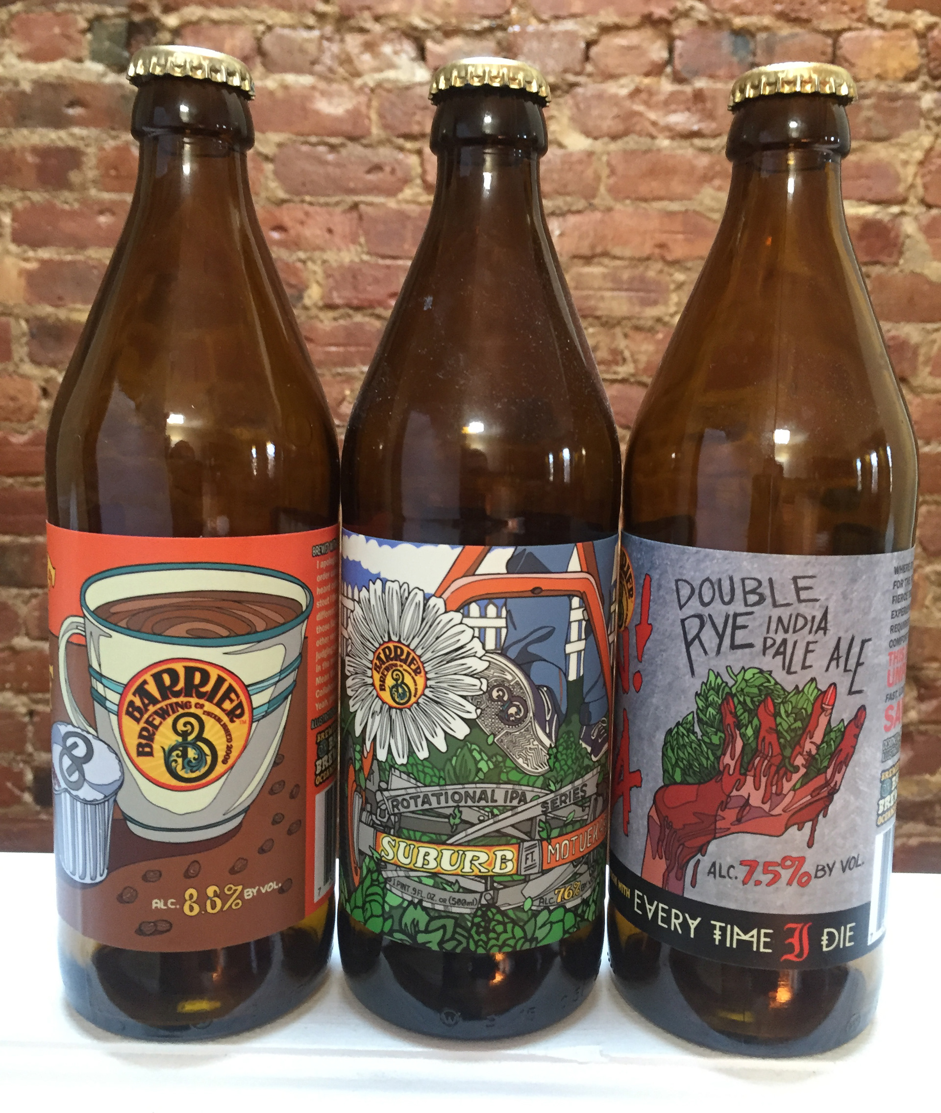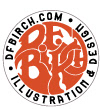
I thought I would go over 3 labels I did recently for Barrier Brewing Company in this post. Two of them are collaborations, one with a brewery and the other with a metalcore band, all of them very tasty indeed inside and outside of the bottle. Below are sketches and thought processes that went into them. Cheers!
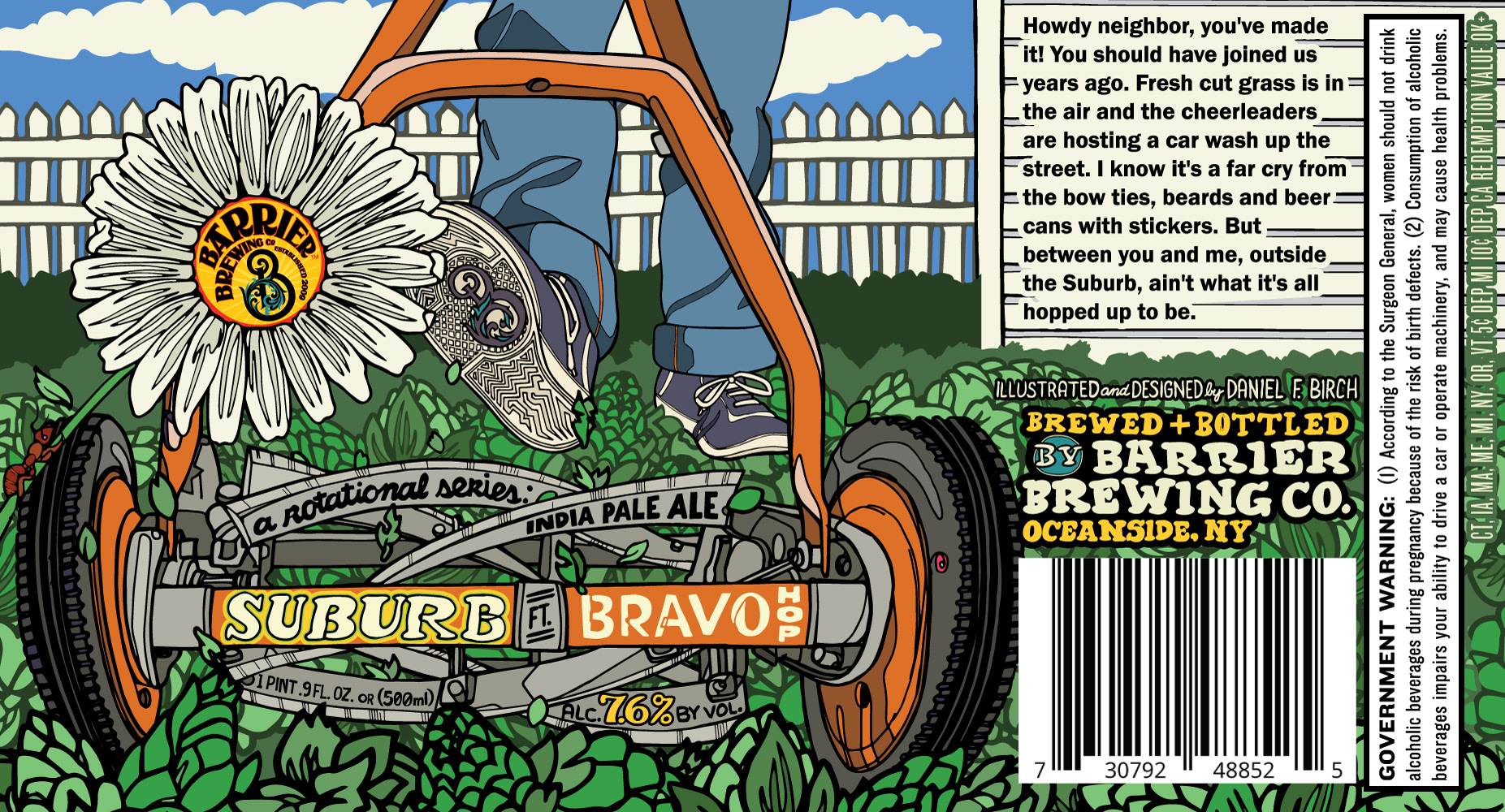
We'll start with A Rotational Series: India Pale Ale Suburb and this particular one is the newest of the bunch which features Bravo hops. The original idea we all discussed was to have some goofy things that you can only do in a suburb. So I researched photographs of the 50s, watched Edward Scissorhands for the feel and all the while in those photographs, lawnmowers kept showing up. That just led me to think why don't we just focus on the lawnmower. I personally think the push mowers are the most interesting to look at.
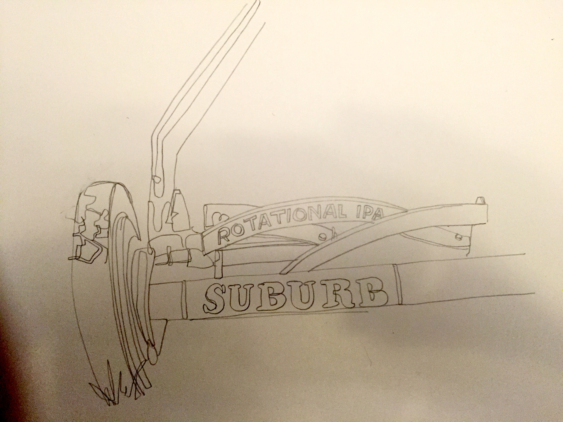
This was the original pencil sketch that I realized, all the blades are a perfect framing tool for everything. I sent this originally to Barrier to see if they were as thrilled as me. They were.
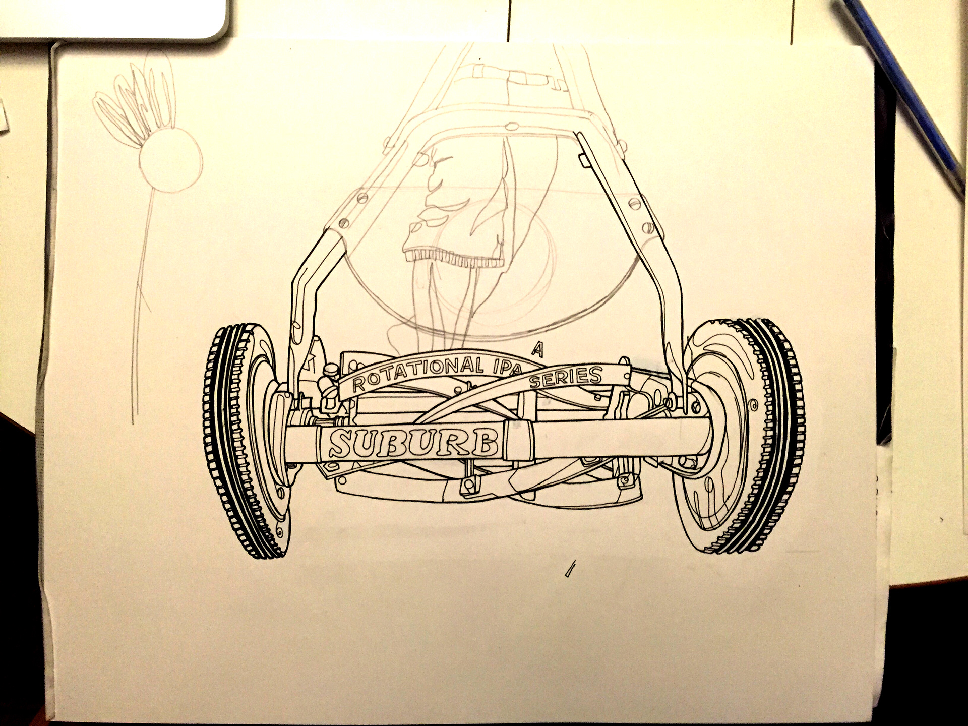
Here's the same drawing further on. I was thinking the Barrier logo was going to be on the mower. I drew some legs and realized that they would be covered up which I didn't find as interesting.
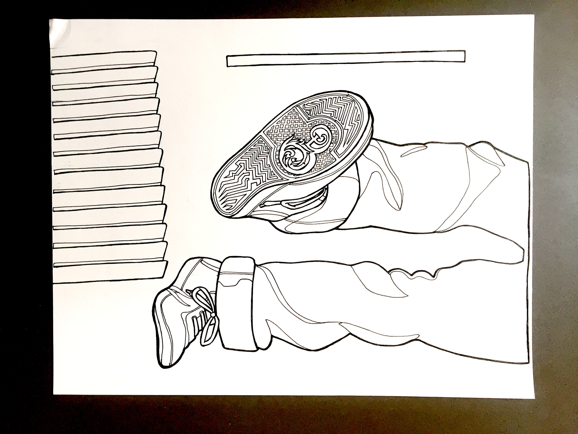
I thought it would be easier to draw the legs needed separately so...
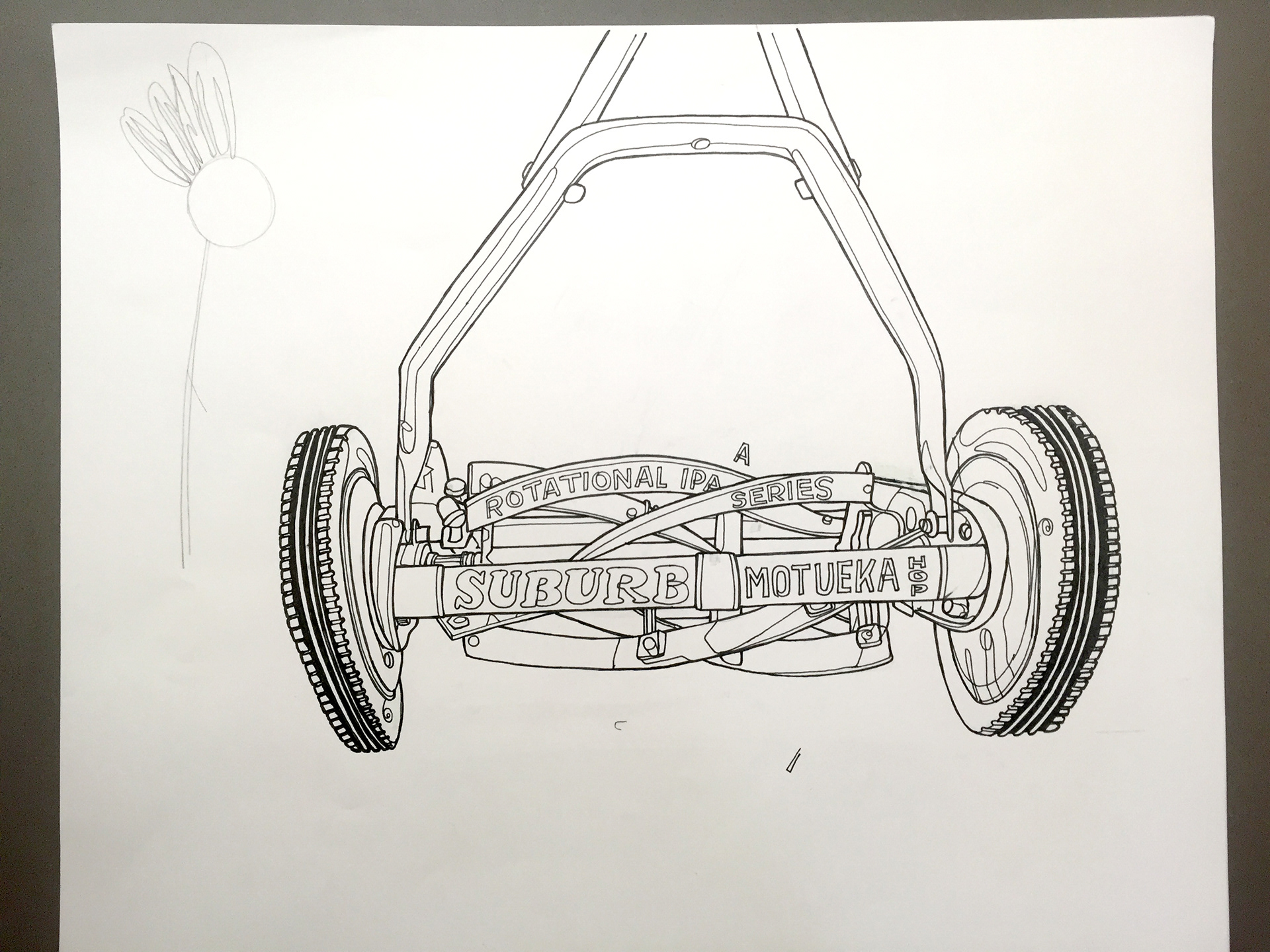
The other parts are the siding for the house.
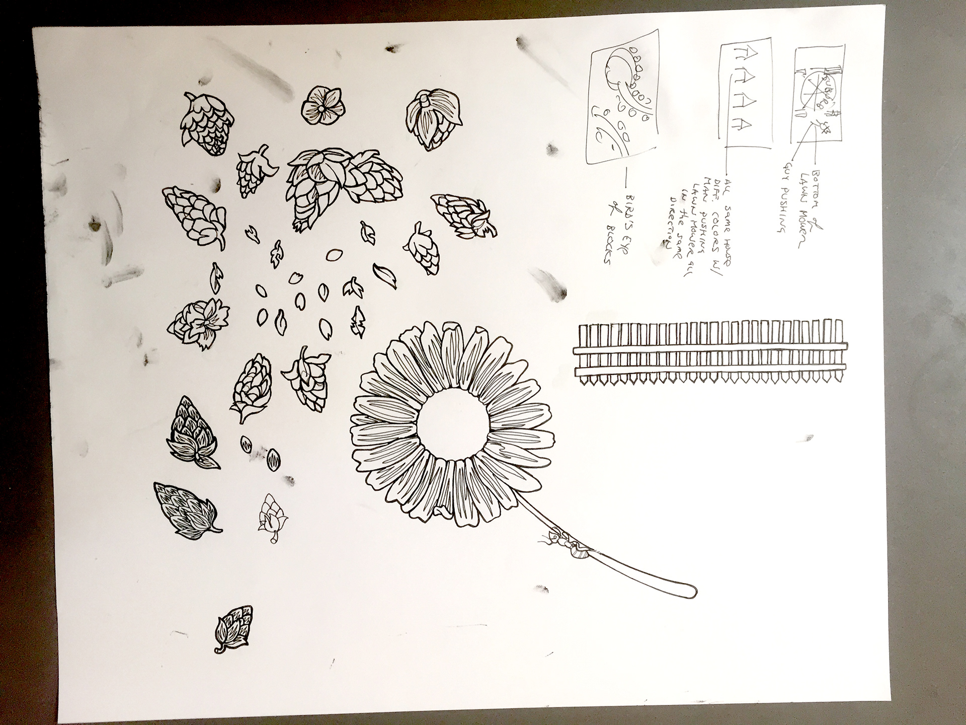
Here are all the hops used for the lawn and the daisy. Also in the top right are 3 original ideas I had for this label. Unfortunately, I had a bit of a leaky pen so that's why there were some ink smudges all over it. Meh! That's pretty much sums up that label. Moving on...
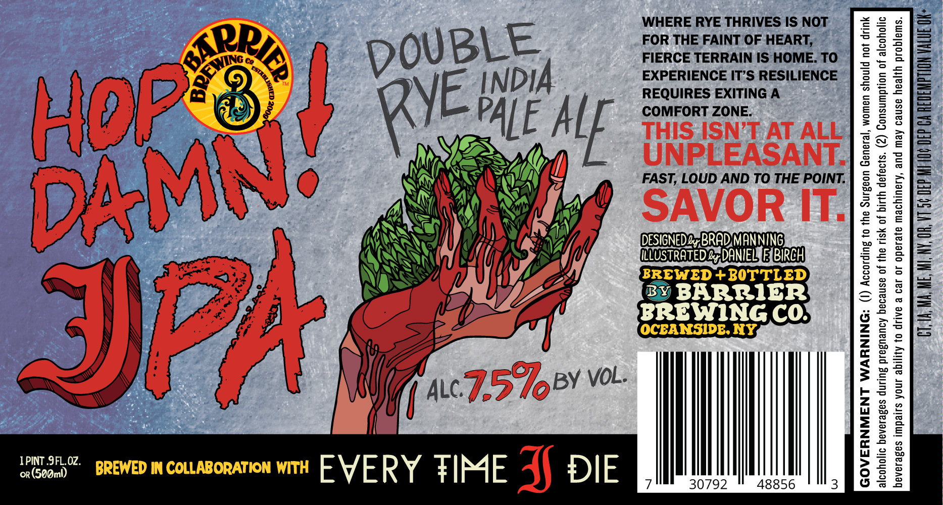
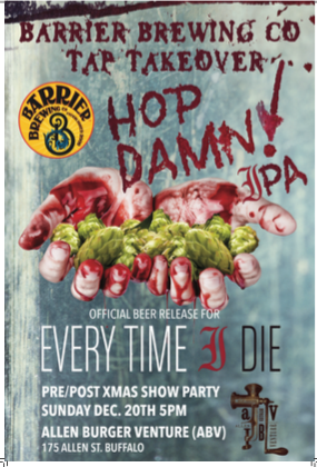
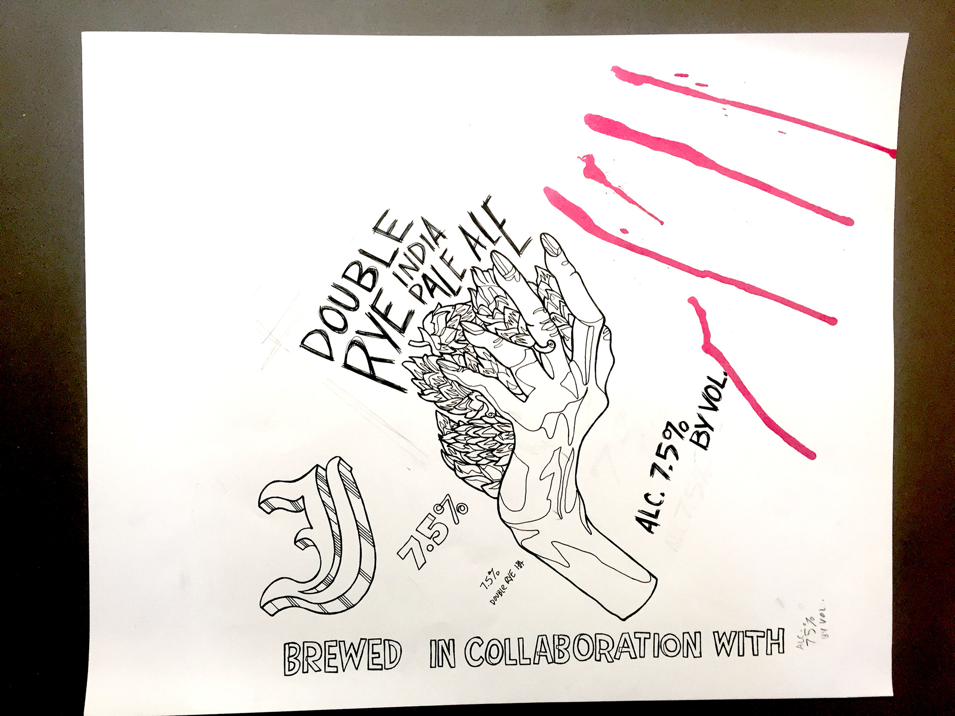
This was the label for the collaborative beer with the band Every Time I Die. I worked with Brad Manning who designed the original poster for the original tap release so I thought he deserved credit as designer on this one. Below is the original poster, sorry I couldn't find a larger one.
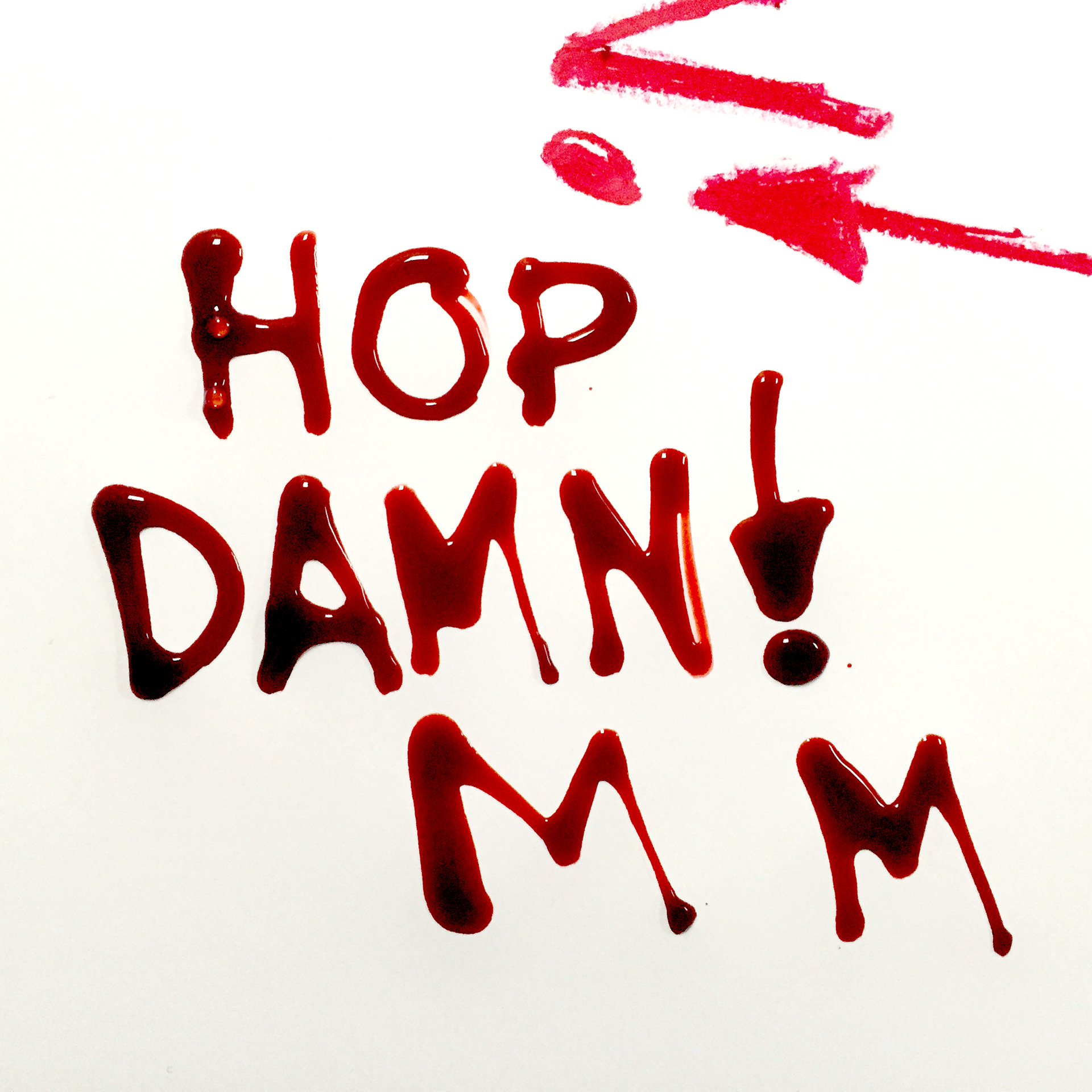
I tried to mimic writing with blood by using fake blood that I had left over from Halloween. It didn't really work so well but it was fun to play around.
Below is the original drawing. There's also some red ink splotches as I was thinking I was going to use them to make the blood on the hands. Alas it did not look nearly as good. I ended up drawing the blood with my Wacom tablet directly in illustrator.
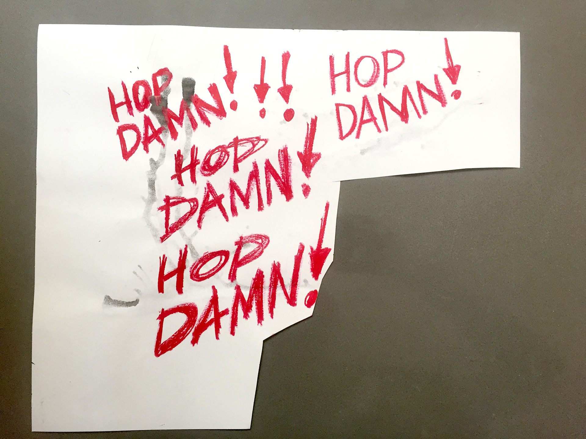
Here were the versions for the logo that I did with a big crayon which after a little minipulation in Illustrator, worked really well for the final. The fake blood drawings were where the paper was cut off as I couldn't scan it with that stuff on the paper. Afterwards, I used it for ink splatters and such but none of it ended up getting used.
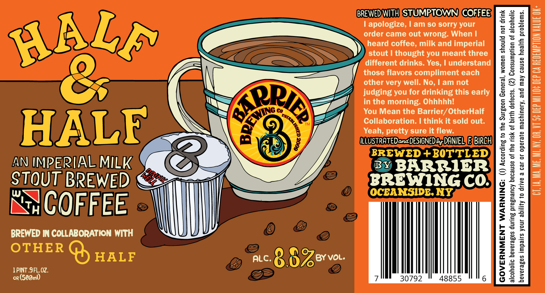
Below is the Other Half collaboration beer brewed with Stumptown Coffee. This one was pretty simple. Evan wanted a cup of coffee and a thing of creamer. That's pretty much all I had to do. I remember making a nice hot cup of Stumptown coffee right before drawing it which I also used for partial reference (not that I needed much for this.
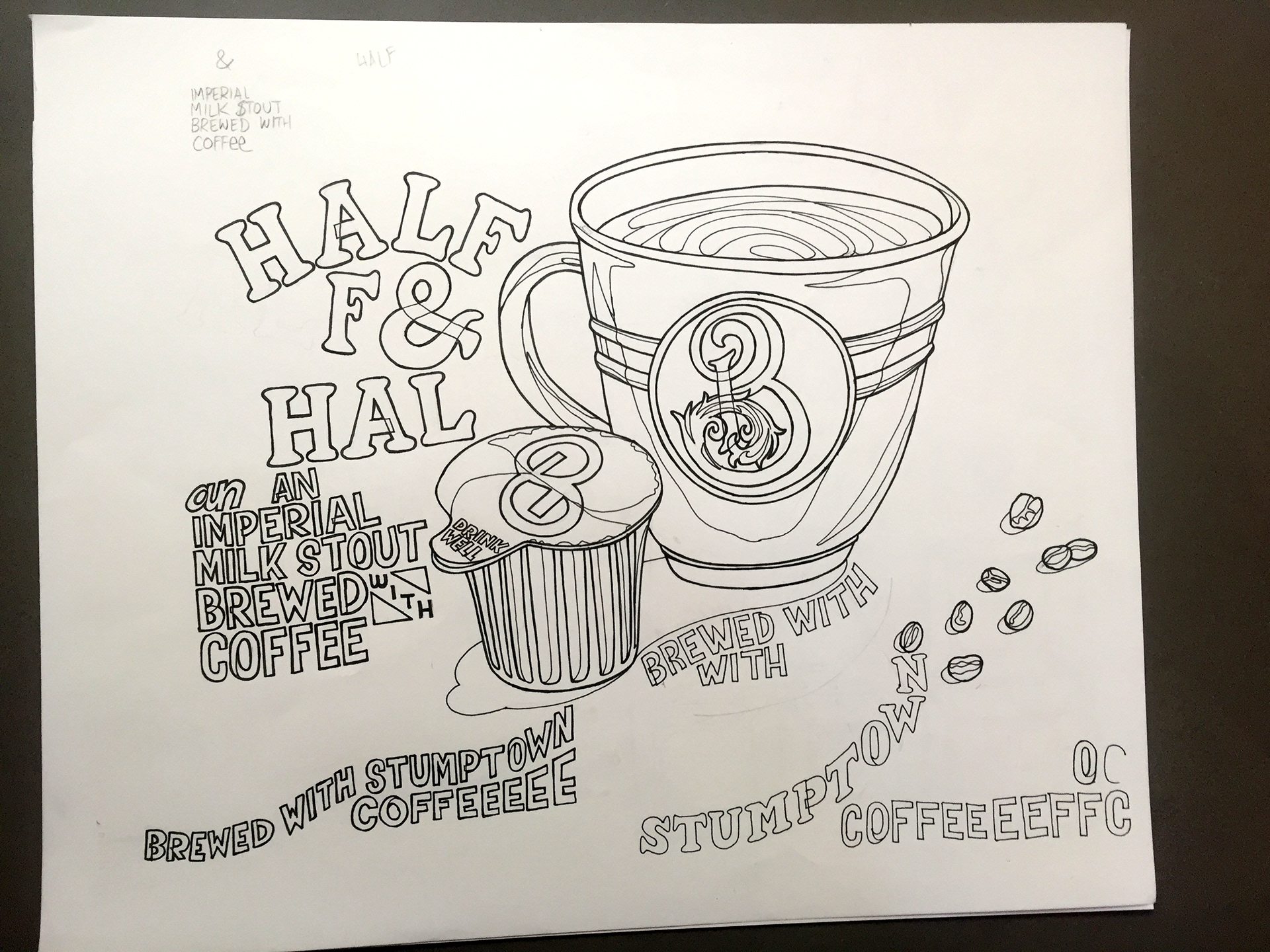
This was the original drawing. You can see I ran out of room writing out "Half & Half" and it had Stumptown coffee drawn out which was originally going to be where the abv was but after quite a few revisions on the lettering it ended up they wanted only a small reference as big as my signature. I didn't end up using the drawn Barrier "B" as I thought it worked better to have the actual logo there.
That about wraps it up! Hope you all enjoy the labels. The beer inside all of these bottles I found to be quite great and that's what makes me happy working along with this awesome freakin' brewery. Cheers!